1
Back when I was an aimless college student, in a stroke of incredible dumb luck, I stumbled upon a book called Getting Real that was written by the founders of Basecamp.
Before I read it, I had no idea what it meant to run an internet business. After I read it, I knew exactly what I wanted to do with my life.
So you can imagine how it might feel for me to hear, ten years later, that Basecamp is building a new email service. Mostly, I’m excited! But also there’s a tiny amount of... dread? It’s like when your favorite band from high school releases a new album. You want to love it. But the odds aren’t good :(
This pretty accurately captures my reaction to HEY: it has a lot of cool ideas, and I want to love it...
...but I just don’t.
The worst part, to me, is the design. The sizing and spacing of the interface is borderline geriatric. I want information density, and speed! But the worst is the names.
Words can’t express how much I don’t like the cute names HEY has for everything. The worst by far is “Imbox” (not a typo™!) which they use to mean “important inbox.” But that’s not the only thing. They also have “The Feed” and “Paper Trail” where newsletters and receipts go, respectively. There’s also a thing called the “Speakeasy Key” (Ahhh! 😧) which is basically a password you can tell people to put in their subject lines which guarantees you won’t miss their email.
Questionable taste aside, I have to admit that HEY is full of great ideas and fascinating trade-offs — it really is the most unique take on email I’ve ever seen. And because the most bold choices form into an interlocking system, it’ll be hard for competitors to copy it piecemeal. (A smart strategic choice!)
So I thought it’d be fun to explore their choices and see what we can learn from them.
2
The fundamental problem of email is that it’s full of stuff we don’t want. But we can’t ignore our inboxes, because there’s a smattering of important and useful messages sprinkled in.
But that’s not the worst part. There’s also a huge mound of in-between stuff that creates conflicting emotions:
- A newsletter you once loved but haven’t had time to read lately, and now feel slightly guilty for not keeping up with, like a lapsed gym membership.
- A notification from a metrics service you set up that you usually ignore, even though in theory you should really be paying more attention to it.
- A request from an acquaintance to introduce you to someone for unclear reasons, which you feel bad for declining, because they seem great, but your schedule is frankly ridiculous at this point already.
These kinds of emails are much worse than spam. If it was just spam, we could delete, unsubscribe, and mute without a second thought. But here we experience cognitive dissonance, which is a much bigger problem.
These little pangs of negative emotion build up over time, and morph into generalized feelings of resentment towards email. It’s like with any other relationship: if the ratio of good to bad moments gets out of whack, it makes you want to give up entirely and leave.
But unlike other relationships, we can’t break up with email.
(Ok, fine. Neal Stephenson can. But the rest of us can’t 😆)
3
So what can we do about it?
Every successful email service has a different take. For example:
- Gmail originally reduced inbox guilt by encouraging you to “archive” rather than “delete” messages, and now uses AI to automatically hide low-priority messages into separate inbox tabs.
- Mailbox, which got 1 million people to sign up for their beta before selling to Dropbox, pioneered the “swipe to archive” and “snooze” design patterns, making it much easier to get rid of stuff you don’t want to deal with right now.
- Superhuman encourages you to start at the top and work straight through your emails one at a time, using keyboard shortcuts for speed. This is faster than the usual “cherry picking” pattern, and helps reduce decision fatigue by automating the choice of “which email to do next.”
But the basic problem of email is still there: it’s full of stuff you don’t want to ignore, but you wish didn’t exist.
HEY has a different approach.
What if you could snap your fingers like Thanos and get rid of all those complicated emotions? What if everything in your inbox was actually obviously important, and the rest was relegated to a secondary screen, or eliminated entirely?
This is the dream that HEY is selling.
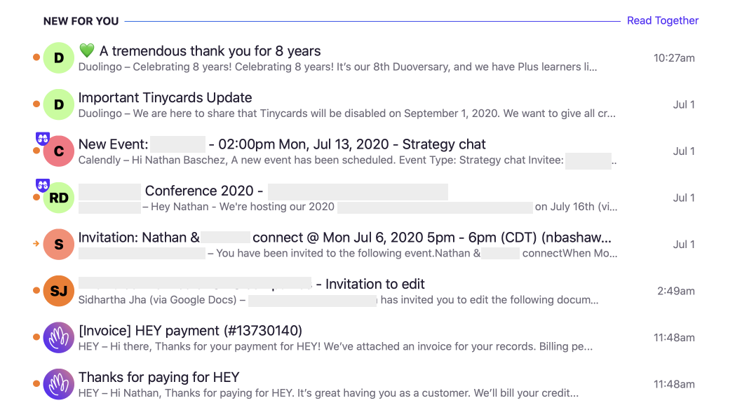
Here’s how it works: Anytime someone new wants to send you an email, they get sent to a waiting room of sorts called “The Screener.” There, you decide whether you want to accept this person’s messages, or delete this and all future emails from them.
Here’s what it looks like:
Once you click “yes” on someone in the screener, the email goes to your Imbox, as will all future messages from that person. You can also choose to send them to The Feed, for newsletters, and Paper Trail, for receipts and stuff.
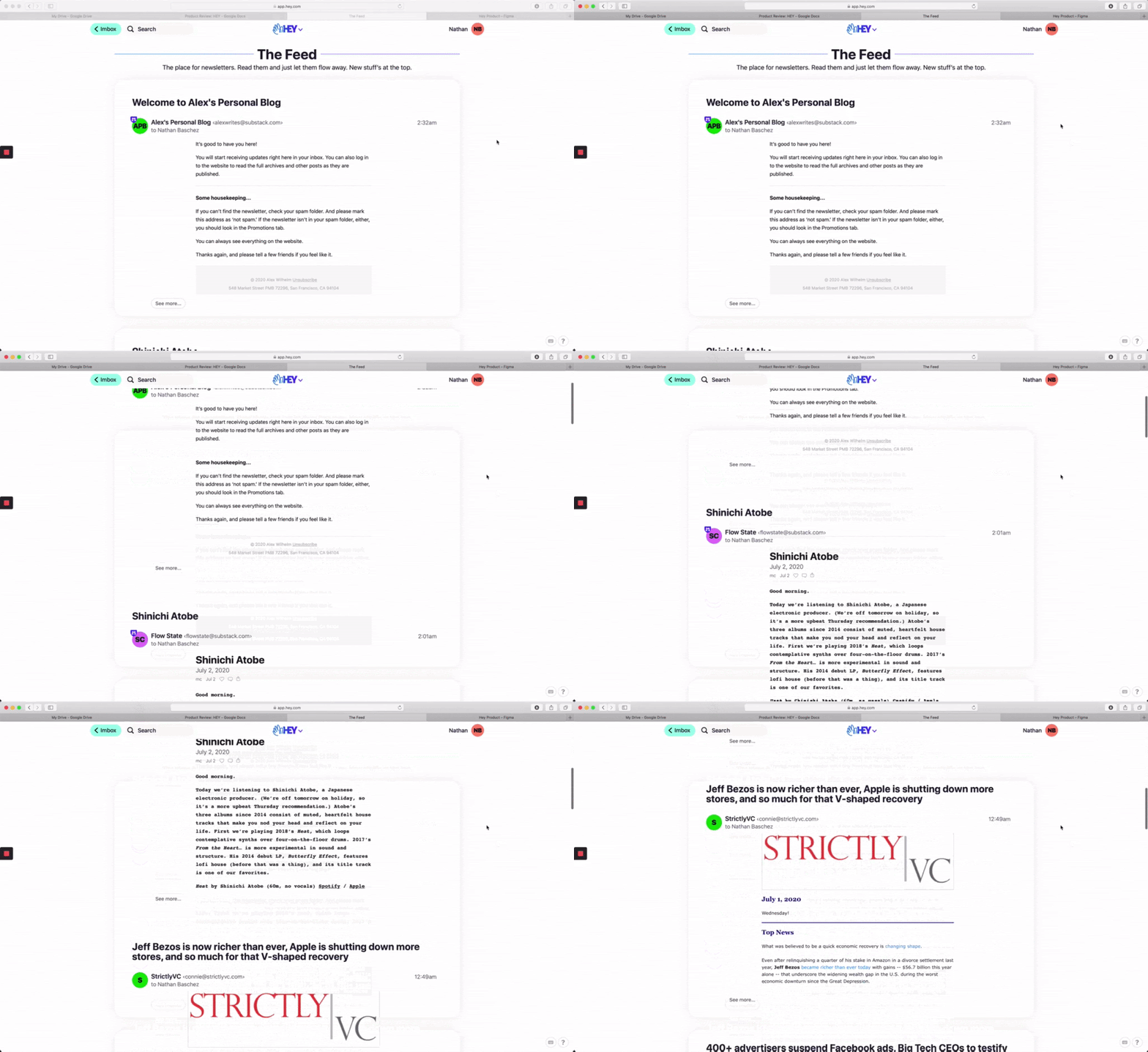
The Feed, in particular, is pretty cool. It’s a nice, almost Facebook-like interface for reading newsletters:
It’s a great idea and I bet more email apps will copy it.
Thanks to the rise of newsletters, we’ve already seen dedicated apps like Stoop and SubscriptionZero spring up to solve this problem. But I gotta say, it’s really nice to have it built directly into your regular email app.
In fact, I loved this feature so much I created a mockup of how it could work in Superhuman, my current email client, and sent it to their CEO:
Of course, this would require them to not only copy The Feed, but aspects of The Screener as well. This is what I meant when I teased in the intro that HEY has an interlocking system (The Screener + Imbox + The Feed + Paper Trail) that is hard to copy piecemeal.
These four main screens are the most important parts of using HEY. They have a few other smaller features that are nifty, perhaps the most notable being “Focus & Reply” where you can reply to a bunch of emails in one scrolling screen with the message on the left and your textbox to reply on the right, but that’s pretty much it.
So, how does it feel to use?
4
The main selling point of HEY is that it hides emails by letting you screen them into secondary inboxes, or out of your life entirely, but there’s one big problem with that approach: it doesn’t do anything about the emails that cause my real cognitive dissonance, and it creates a lot of extra work for me.
Realistically, when I get an email I have conflicted feelings about, I’m almost always going to let the sender into my Imbox, because to some extent I do value their emails. Ignoring all emails forever from someone is extremely harsh, more like blocking someone on Twitter than unfollowing.
Here’s the scenario that makes me almost never screen someone out entirely: what if I get an email from that sender now that’s not important and I have no problem archiving, but in a year I miss something I care about because I blocked them? Sure, maybe they could DM me on Twitter or something like that, but it would feel bad for me and them, and I’d rather just have that stuff in my inbox and act on messages individually, rather than apply blanket rules to senders.
It’s like the opposite of Gmail’s introduction of the “archive” feature — instead of making it easier to get rid of stuff because it’s less permanent, this makes it harder to get rid of stuff because it’s more permanent.
Instead of blocking people forever, I’d love an email client that trains me to say “no” more often. Like, in the onboarding flow help me write a very nice generic “no” canned response, and encourage me to use it. That, in addition to a separate newsletter reader view, would go a long way.
This is actually one of the things I love about Superhuman: when I archive one email, it automatically pops me into the next email. My hands stay on the keyboard the entire time. This reduces my decision fatigue and helps me get everything done faster. I would have loved to see something along those lines in HEY.
But, as it turns out, this is where HEY is weakest.
5
If I had to distill my feelings about HEY into four words, it’d be these:
Great thinking, flawed execution.
It’s not just the slowness, or the cheesy naming, or the high-friction separation of screens like Imbox and The Screener. It’s also a lot of little design details.
For example, if you want to use keyboard shortcuts to roll through your inbox and select a bunch of messages, here’s what it looks like.
Can you tell which thread is currently selected?
If you squint, you can see that the fourth thread from the bottom has a tiny arrow icon. It’s almost laughably missable! Whoever designed this does not often use keyboard shortcuts to navigate through their inbox.
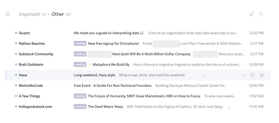
For context, here’s how the equivalent screen looks in Gmail and Superhuman, respectively:
Much better.
I know this is a small detail, but it makes a big difference. If this were the only flaw, it’d be ok. But there are a lot of little things like that. Maybe they’ll get fixed over time? I hope so, but I’m not 100% confident.
I think this might just be the Basecamp design aesthetic. And maybe that aesthetic just is not for me. I prefer smaller, faster, more keyboard-shortcut driven interfaces. Basecamp and HEY feel large and cozy. Great for clicking around and looking nice. Not so good for serious usage.
So, where does this leave me?
6
If HEY was just an email client, I’d probably want to live on it for a week or two before deciding to commit. But it’s not just an email client, it’s also an email service. You can’t use it with your regular email address.
The best you can do to test drive the service is to forward messages to HEY from your existing email account. It helps you get a taste of what it’s like to live on the product. But the only way to really experience it is to start replying to messages, not just reading them. And when you hit “reply” the message will come from your @hey.com email address.
This makes it hard to test HEY. I wrote about this dilemma and how it limit’s HEY’s target market at length last week.
The added friction creates a lot of pressure for the product to be extra compelling. And for me, it doesn’t clear that bar yet.
But we shouldn’t count HEY out just yet. The team at Basecamp is legendary, and this is just a V1.
It would be foolish to underestimate them.
Find Out What
Comes Next in Tech.
Start your free trial.
New ideas to help you build the future—in your inbox, every day. Trusted by over 75,000 readers.
SubscribeAlready have an account? Sign in
What's included?
-
Unlimited access to our daily essays by Dan Shipper, Evan Armstrong, and a roster of the best tech writers on the internet
-
Full access to an archive of hundreds of in-depth articles
-
-
Priority access and subscriber-only discounts to courses, events, and more
-
Ad-free experience
-
Access to our Discord community


Comments
Don't have an account? Sign up!