The Most Advanced Yet Acceptable Products Win
How to strike the right balance between the novel and the familiar in design
Principles of balance are as old as time.
For Aristotle, it was the balance between excess and asceticism. For Taoists, it’s the balance between exerting effort and letting go. And for Raymond Loewy, famous for designing products like the Coca-Cola bottle and the S1 locomotive, and often considered the father of industrial design, the balance was between the advanced and the acceptable.
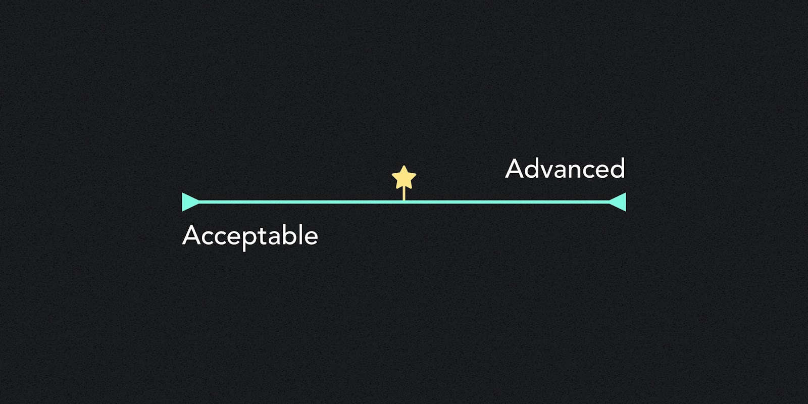
In the early 20th century, to guide the creation of his groundbreaking works, Loewy developed a rule he called MAYA: the most advanced yet acceptable design.
MAYA dictates that the ideal design sits between solutions that are completely novel and entirely familiar. Be too novel and customers will tune you out. Be too familiar and customers will look right past you. Or, in Loewy’s words, “The adult public’s taste is not necessarily ready to accept the logical solutions to their requirements if the solution implies too vast a departure from what they have been conditioned into accepting as the norm.”
MAYA is the sweet spot: novel but familiar, advanced yet acceptable. And it can make or break the success of innovations.
To better illustrate MAYA, I’ll highlight hits and misses from three high-profile tech categories: smartphones, wearables, and generative AI. I’ll use these examples to demonstrate how you can apply these principles to your designs, create products that resonate with your target audience, and bridge the gap between innovation and acceptance.
Why the iPhone was a hit and folding phones aren’t (yet)
Hit: the iPhone
When it was introduced in 2007, the iPhone represented a big leap forward in mobile technology and a dramatic departure from traditional telecommunications. Although the product was novel and full of tech advancements, Apple made it feel familiar and acceptable in a number of ways.
First, the device leveraged design continuity from Apple’s existing products. While the iPhone was new, its industrial design was reminiscent of the contemporary iPod, which was already familiar to many consumers.
Second, the touchscreen technology was highly intuitive and understandable. The experience of manipulating the interface directly with your fingers made it familiar notwithstanding its novelty. It helped digital interactions better mirror those of the real world.
And third, the device leaned into the familiarity of the phone. Despite its innovative features, the iPhone retained longstanding phone functions that users understood, like calling and SMS. Framing the device as a phone gave people a familiar mental model to understand the new technology and imagine how it might fit into their daily lives.
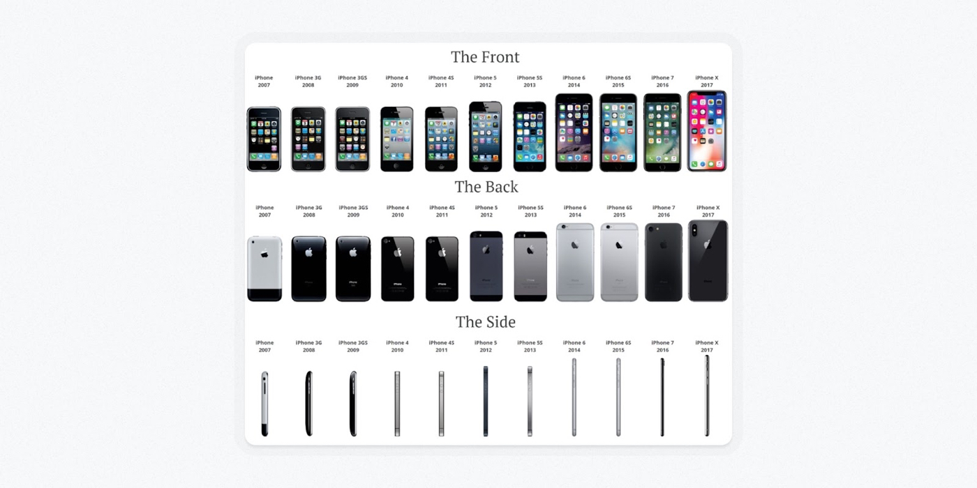
Since the iPhone broke through, Apple has been careful not to upset its MAYA balance. After that initial spark, the design has been stable from generation to generation, helping the iPhone become a powerhouse that’s still baked into our daily operations 17 years later.
When Apple does inject changes to the iPhone, it’s cautious and intentional about doing so. Two of the more dramatic shocks to the iPhone’s MAYA balance were the removal of the home button (on the hardware side) and the move away from skeuomorphism in iOS 7 (on the software side). From the iPhone's deliberate evolution, one might assume that Apple recognizes when it has reached sufficient familiarity to make bigger changes that advance the form.
Miss: folding phones
Over the last five years, the folding phone market has continued to grow but has yet to break into the mainstream. While blending smartphone and tablet-like functionality into a single device opens new avenues for mobile technology, companies haven’t remedied the fact that most people still don’t see folding phones as an acceptable and familiar option for daily use.
A few tactics might help move the needle:
- Continue to improve the ergonomics of the hardware
- Refine the software to make better use of the device’s multiple form factors
- Decrease costs substantially to bring the devices more in line with people’s expectations for non-folding alternatives
- Let time and consistent exposure work their wonders for building familiarity in the public eye
I have little doubt we’ll eventually see a folding phone hit the MAYA sweet spot. How long will it be? Who knows. But I’m certain that when it happens, the company that finds it will have succeeded in large part by shifting the product’s MAYA balance back in the direction of familiarity.
How Apple beat Google to wearable tech
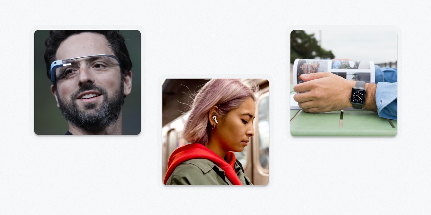
Google Glass, Apple Watch, and AirPods. Source: Patrick Morgan
Miss: Google Glass
Google Glass was an overly hyped foray into wearable technology back in 2014. In retrospect, the project was very advanced but nowhere close to acceptable for the average consumer. It may have been decades ahead of its time in terms of general consumer sentiment.
In recent years, Meta has driven significant growth in the virtual reality space, but no wearable AR/VR glasses have had a widespread breakthrough moment yet.
It seems that the MAYA sweet spot for this type of product will only arrive after years of gradual consumer acclimation via more approachable forms of wearable tech.
Hit: Apple Watch and AirPods
What wearables did consumers gravitate to instead of Google Glass? For the most part, watches and headphones.
These design executions were reinterpretations of familiar pieces of tech that felt less invasive to most people’s daily modes of living. Devices like the Apple Watch and AirPods were perhaps less advanced than Google Glass, but much more acceptable—so the market rewarded them.
While Apple Watch and AirPods have become hits for Apple in their own right, we can now also see them as clear stepping stones toward the company’s venture into what it calls “spatial computing.” The many iterations of these products allowed Apple to gradually familiarize a large consumer base with concepts like spatial audio and the digital crown. And now, a full decade after Google Glass, these seemingly small technical advancements are combining to form the foundation of Apple’s next big swing, the Vision Pro.
Question mark: Apple Vision Pro
Right now, it’s impossible to say how the Vision Pro will land upon its first release in 2024. But my takeaway from Apple’s introductory keynote is that the company is keenly aware of how out of balance virtual reality goggles have been on the MAYA spectrum until this point.
At $3,500, the device is priced to restrict its immediate audience to die-hards more comfortable with accepting novel technologies. And while the digital display of a user’s eyes spawned many memes, the feature shows how Apple is thinking about human factors that might block the device's adoption due to low acceptability.
If I were to venture a guess, I’d say the roll-out of the Vision Pro will look something like a hybrid between our earlier examples of the iPhone and folding phones: the core innovation may be as substantial as the iPhone, but the rounds of iteration required to achieve widespread acceptability and adoption may look more like the extended rollout of foldables.
How ChatGPT helped OpenAI hit MAYA
GPT-3 access via the OpenAI Playground vs. Chat GPT. Source: Patrick Morgan
A miss, followed by a hit: OpenAI Playground to ChatGPT
In the last year, generative AI underwent a mass breakthrough via the explosion of interest in OpenAI’s ChatGPT.
What I find fascinating about ChatGPT’s breakthrough is that its core tech has been open to the public since 2020 via other interfaces, and yet it didn’t resonate in the same way. The team at OpenAI hadn’t uncovered the right packaging to make the underlying technology approachable for the general market. Then, after a few seemingly minor changes, ChatGPT exploded.
Two related design choices stand out for their outsized influence on correcting the MAYA balance:
- Pivoting the interface to a conversational chat style made the interaction design more familiar
- Feeding the context of the chat thread to the model with each prompt to create the illusion that it understood the flow of the conversation increased the user’s margin for error in prompting, making the experience more approachable for new and returning users.
These choices may seem small in the grander development of large language models. However, they were enough to nudge text-centric generative AI from advanced BUT NOT acceptable to advanced AND acceptable. They shifted the MAYA balance toward the sweet spot, and in doing so vaulted us into a whole new era of computing.
Getting designs to MAYA
Answer this question honestly: Is the core of your product familiar or surprising? Once you’ve found your baseline, use design to shift the force in the opposite direction until you find a balance.
If you come down on the side of being surprising, you might invoke familiarity to help potential customers see the light. You could:
- Use language that your audience is accustomed to
- Lean into common design patterns that lessen the cognitive load of learning the new technology
- Piggyback the new concept onto an existing mental model to give potential customers a frame of reference to consider how the new tech might fit into their lives
On the other hand, if you come down on the side of being familiar, you can encourage surprise by rocking the design boat to gain recognition. In this case, you might:
- Use new language that stands out in a crowded space
- Adopt a bolder visual style that provides a clear visual differentiator between your product and its competitors
- Capture what’s unique about your offering and accentuate it. Go more extreme than you think you need to, then dial it back. Playing it safe won’t work here.
Journalist Derek Thompson sums up this approach succinctly: “To sell something surprising, make it familiar; and to sell something familiar, make it surprising.”
In the pursuit of MAYA, it’s important to remember that neither direction is right or wrong. Surprising isn’t “good,” familiar isn’t “bad,” and vice versa. They are just equal and opposite forces, like the design equivalent of Newton’s third law of motion.
Our job as product creators is to find their natural balance, encourage their equilibrium, and tend to the homeostasis of their inherent tension. Do that, and you’re well on your way to hitting the MAYA sweet spot.
Patrick Morgan is a designer and the creator of Better by Design, a guide to crafting great design, quality business, and a prosperous creative life. Over the course of more than a decade, he’s helped companies like Leo Burnett, American Express, and Fastly craft category-leading brand and product designs.
Find Out What
Comes Next in Tech.
Start your free trial.
New ideas to help you build the future—in your inbox, every day. Trusted by over 75,000 readers.
SubscribeAlready have an account? Sign in
What's included?
-
Unlimited access to our daily essays by Dan Shipper, Evan Armstrong, and a roster of the best tech writers on the internet
-
Full access to an archive of hundreds of in-depth articles
-
-
Priority access and subscriber-only discounts to courses, events, and more
-
Ad-free experience
-
Access to our Discord community


Comments
Don't have an account? Sign up!
A wee bit too Apple sided. Would be great to have some other companies and product categories shown here.
@saurwein Sony Walkman?