When Apple unveiled Vision Pro, its first new hardware platform since the Apple Watch’s launch in 2015, it was the first time most of us had seen it. And yet, if you’ve used Apple products at all over the past decade, the product’s design was almost déjà vu.
A curved pane of black glass. A brushed aluminum body. A cloth headband and a braided power cord. Upraised, rounded rectangle buttons. A Digital Crown.
The Vision Pro wasn’t an iPhone, or an Apple Watch, but its design was clearly related to both. There was an uncanny feeling that you’d seen this thing before, that you almost could have predicted what Apple was building if you’d looked in the right spot.
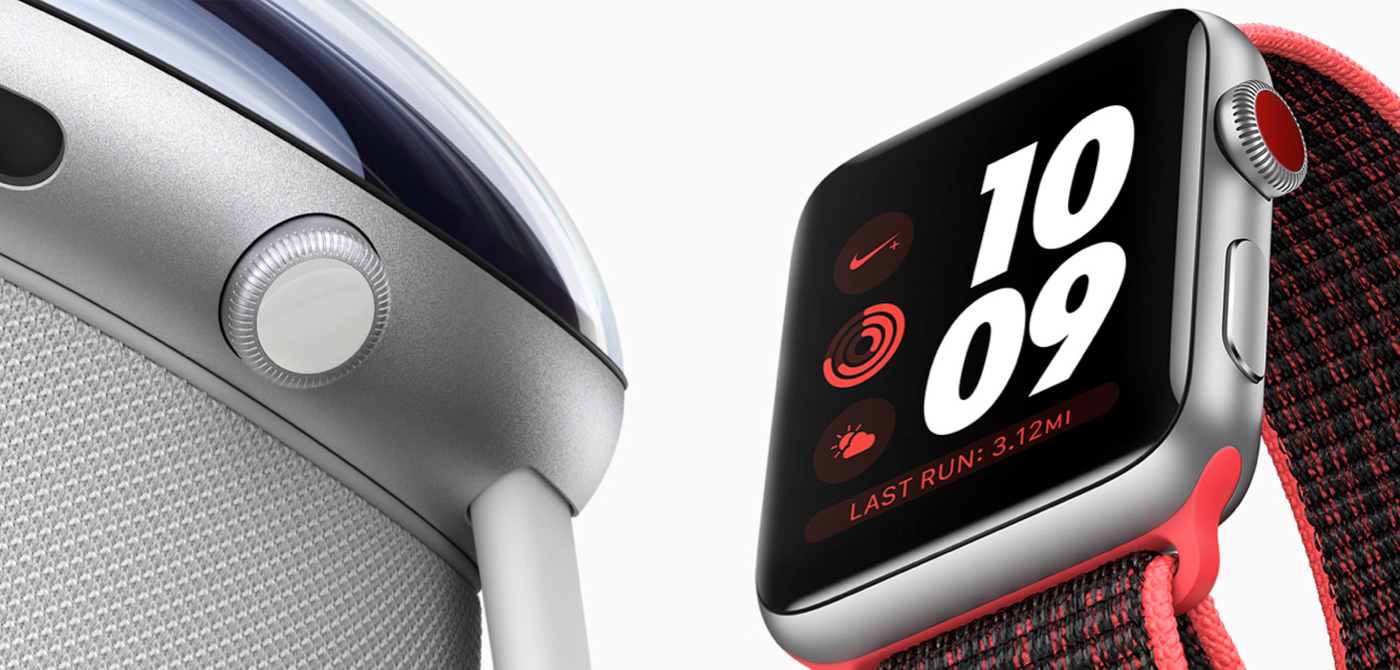
The Digital Crown—the small round knob on the right of the Apple Watch—was lifted straight from horology, when the watch first launched in 2015. As an analogue to the crown used to set and wind a traditional watch, it was a way to anchor the Apple Watch to its mechanical ancestors, launched alongside the first generation’s solid gold case. For the button-averse Apple, it was almost a surprising bit of physical excess.
Then the Digital Crown gained a second life as a volume knob on Apple AirPods Max in 2020. It began its third life on Monday, as the way to dial the real world in or out on the Vision Pro headset. The Digital Crown went from an homage to a default new Apple input control.
If you’ve ever worn a watch before, you know instinctively how to use the Apple Watch crown. Now that familiarity is paying off for Apple again: If you’ve ever worn an Apple Watch, you already know how to use at least one part of the Vision Pro. The learning curve of virtual reality is high, and Apple can bring it down a bit with familiar design elements. That familiarity is part of what makes the Apple ecosystem so sticky.
The Digital Crown on the Vision Pro is most reminiscent of the Digital Crown on the Apple Watch Series 3, the first with cellular support and a corresponding colored dot on the Crown.The Vision Pro is filled with recognizable design elements, things we’ve seen and used before. Even the smaller details were anchored to past Apple products. Apple Watch Ultra’s Tail Loop band—the black one, at least—came with an orange pull tab (alongside the Ultra’s other orange highlights). That, too, showed up in Vision Pro’s headband, orange and all.
Same for Vision Pro’s battery pack, which looks like nothing more than an aluminum variant of the MagSafe Battery Pack (a magnetic power bank for the iPhone released in 2021). And the Vision Pro’s cloth-covered “woven power cord” came first with the HomePod before showing up in the M2 MacBook and the Apple Watch Ultra.
The little details *chef’s kiss*
This is just the beginning of a long list of tech the Vision Pro imported from other Apple products. Some of the copied hardware feels obvious, like the M2 CPU. Of course the headset would use Apple’s latest CPU.
Other aspects of the Vision Pro are delightfully unexpected. They help us finally make sense of stuff Apple’s been building for a while.
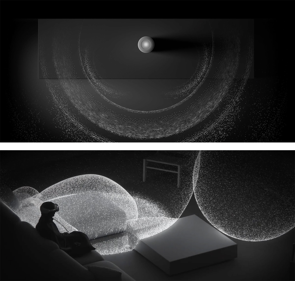
Take Spatial Audio for example. Apple’s seemingly random developments in the audio space started with the HomePod in 2018, which seemed like a side project for the tech giant. Yet that’s where Apple first started experimenting with what it then called “spatial awareness to... automatically adjust the audio.” They shortened the name to Spatial Audio with the launch of the iPhone11 the next year.
Apple went to the trouble of remastering Apple Music in spatial audio for AirPods, and it all felt like a bit of wasted effort. That is, until Spatial Audio became a keynote feature in a virtual reality device, where sense of presence is the whole game. Then it all made sense. Perhaps you could have virtual reality without spatial audio, but it wouldn’t be nearly as immersive.
Suddenly a half decade of seemingly unrelated audio investments made the Vision Pro a better product from launch.
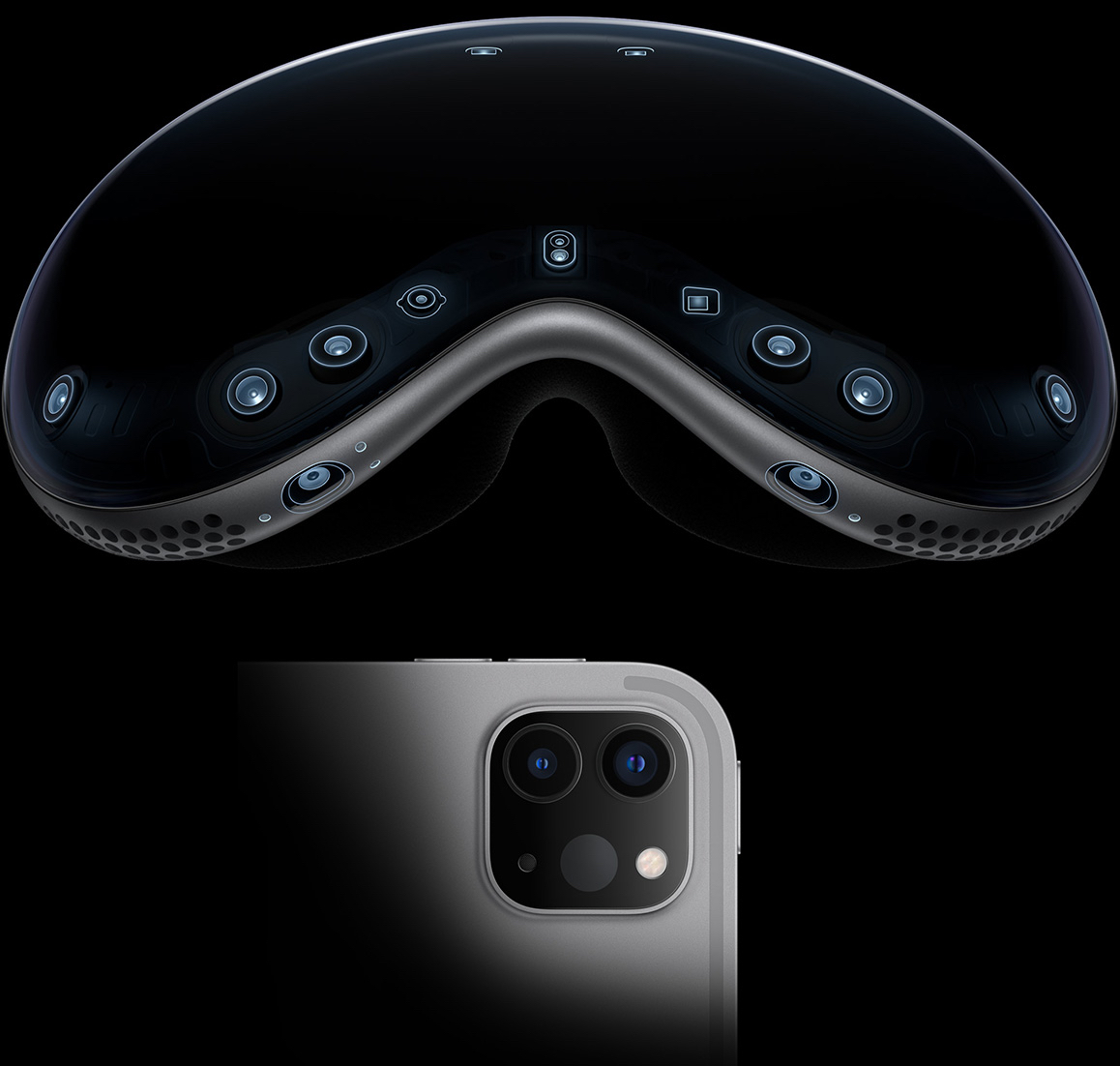
Even Apple’s animation explaining Spatial Audio on Vision Pro is directionally similar to the HomePod’s Spatial Audio animation.Many features in other Apple devices found their logical endgame in the Vision Pro. Take, for example, Apple’s experiments with LiDAR (“light detection and ranging” sensors, used to detect depth in adaptive cruise control, among other things). When Apple first shipped it on the 2020 iPad Pro, its press release said: “The breakthrough LiDAR Scanner enables capabilities never before possible on any mobile device.”
Yet the use cases were few and far between. It helped the built-in Measure app to take better measurements of your room, but it never seemed to be a truly needed feature on the iPad. As The Verge’s Dieter Bohn wrote at the time, you’re “paying for LiDAR you may not use.”
Maybe Apple built it into the iPad as a way to experiment with the LiDAR sensor and get early data on its usage, before building it in as one of the core sensors in Vision Pro. It’d be hard to build an AR/VR headset without that sensor. And it would be hard to get real-world experience in working with the sensors without shipping them in a mass-market product.
Who knows—perhaps the LiDAR sensor now in iPads and iPhones will be the foundation of 3D photography for Vision Pro in a future update.
It’s not just hardware features that Apple ships in one product to later reuse in another. It experiments with software in the same way. Take the hover effects, introduced with 2022’s iPad Pro. It detects when an Apple Pencil is near the screen and slightly increases the icon size when you’re hovering nearby.
It’s reminiscent of an earlier feature on the Apple TV; if you move your finger around the remote’s trackpad on an icon, you’ll see a slight 3D effect as the icon moves around with you. The Vision Pro turns those both up to 11, with icons that expand and move in 3D when you *look* at them.
You’ve seen this effect before, on your other Apple devices, so it’s both immediately familiar and new at the same time on Vision Pro. In a way, it’s cumulative of a decade of Apple’s design work.
As software designer Andy Matuschak shared after Vision Pro was announced, iOS 7—the original “flat design” iOS from 2013—was originally meant to have parallax effects throughout the operating system to add a sense of depth. It was deemed “too much” and cut from that release, but a decade later, similar animations fill the Vision Pro’s operating system.
“It's much more natural in the context of a full 3D environment, and the Vision Pro can do a much better job of simulating depth,” wrote Matuschak. “Timing is everything.”
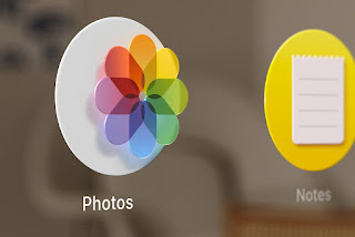
Flat UI isn’t so flat anymore, with eye-motion-activated 3D icons on Vision Pro.Trying to find the right product, placement, and timing for a feature seems to be a recurring theme with Apple.
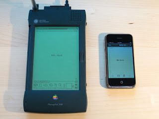
Take the Newton, Apple’s first stab at making a more personal, portable, touchscreen computer in the 1990s while Steve Jobs was away building NeXT. It’s best known as a failure, yet it introduced UI elements that have stayed with Apple’s platforms to this day. Delete a note on the Newton, and it’d be sucked into a trash can in the lower corner of the screen. Delete a note on the iPhone, launched over a decade later, and the same animation carried over.
The Newton was ridiculed for its poor handwriting recognition, but some of its writing interface lives on in the iPad today. If you wrote text on the Newton that you wanted to delete, you’d scribble an oversize W over it and it’d disappear in a puff of smoke. (That’s the same animation that macOS used to show when you removed an app from the dock.) Use an Apple Pencil to write text on an iPad today, and the same W scribble will select and delete any text you need to correct.
The idea was right—handwriting is the most natural way to interact with a device. It just took two decades before Apple perfected it in the iPad.
Apple’s original portable notes device, the Newton, beside the Notes app running on the original iPhone (via Blake Patterson, Wikipedia)Once you start noticing how often Apple builds in public—how they launch a design then repurpose it later—you can start to catch glimpses of new Apple products before they launch. The 6th generation iPod Nano, in 2010, looked almost like an Apple Watch and even included watch faces—half a decade before the watch actually launched.
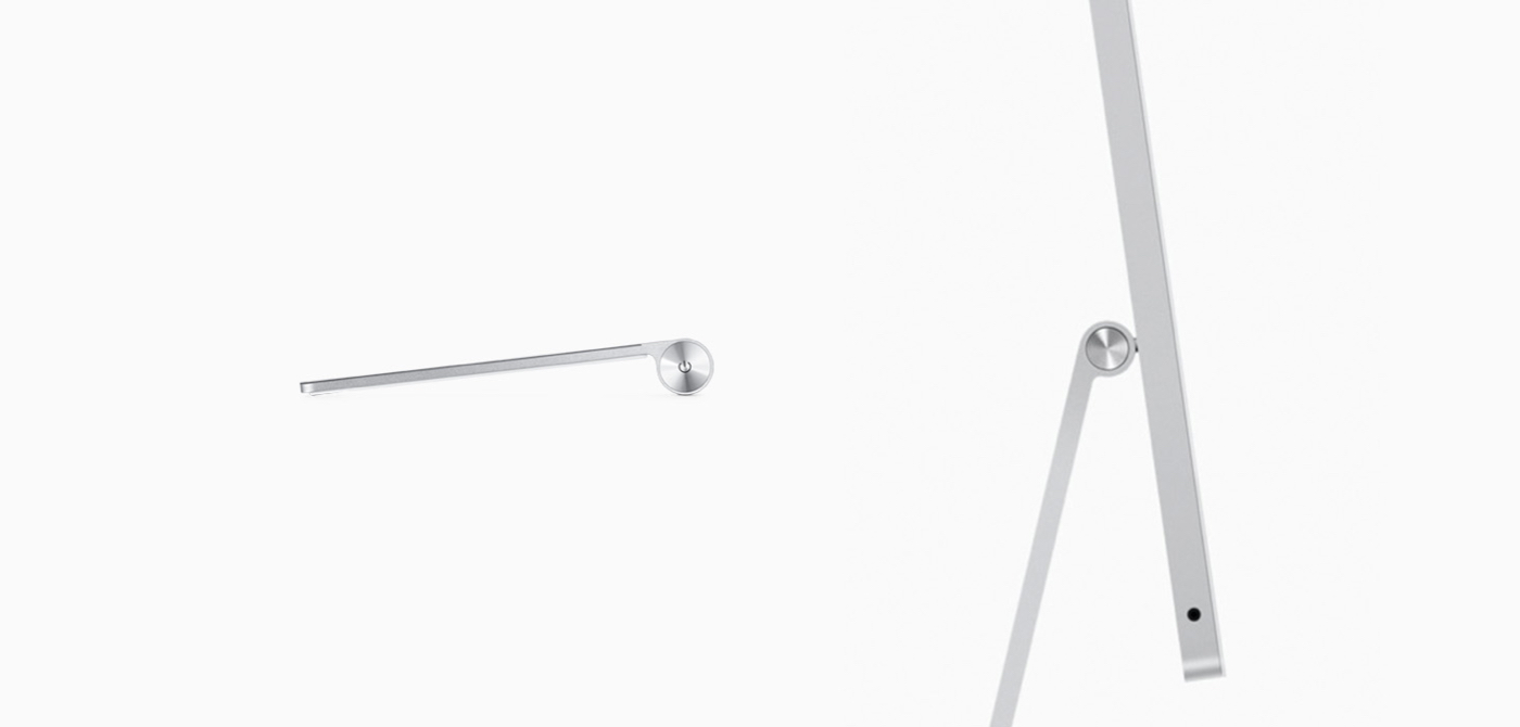
The original Apple Magic Trackpad’s battery hump looks nearly identical to the M1 iMac’s hinge. The “trash can” Mac Pro with its black anodized body from 2013 led us to the Jet Black iPhone 7 and the Space Black stainless steel Apple Watch. And the Apple Watch and its sports bands bear more than a passing resemblance to the Ikepod Chronopod—a mechanical watch designed by Marc Newson, whom Apple consulted with for the Watch project.
Echoes of long-gone Apple products live on, years after they were first introduced, in even the smallest design elements.
The Magic Trackpad design from 2010 was seemingly carried over to the M1 iMac’s stand over a decade later.Apple doesn’t invent in a vacuum. Sometimes it tries something once, then cuts it, only to bring it back again years later in a different form. (See this year’s new emphasis on Widgets, something originally launched on the Mac nearly two decades ago.) Sometimes Apple invents something and seemingly beta tests it in one product, only to later feature it in a future product where it makes more sense. (Watch faces on the iPod then Apple Watch, LiDAR on the iPad then Vision Pro.) Sometimes the design DNA carries through product lines, where a good idea in one place lives out a second life in another (trackpad design to screen stand).
And that means you can improve your odds of guessing which features in today’s Apple products might show up in other Apple hardware and software in the future.
The future
An overly grand and obtusely broad way to picture Apple’s R&D strategy is revenue subsidized development. Each new product stack and each new science breakthrough is incorporated across the product line.
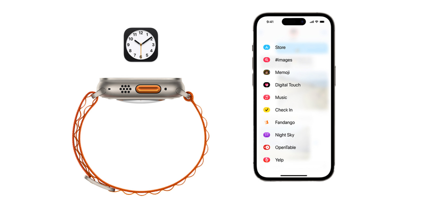
The trend of orange highlights from Apple Watch Ultra has already shown up on Vision Pro; it wouldn’t be too surprising if the orange Action Button shows up in future products. The ceramic Apple Watch seemed like an experiment; perhaps we’ll see that material return in a new form (like a lighter-weight Vision Pro headset?).
Animated icons? Action buttons? New sharing menus? Today’s Apple products hold hints for its future plans.
Messages in iOS 17 includes an entirely new menu for apps and sharing; there’s a very good chance that menu appears throughout the OS down the line. The Clock icon on iPhone and iPad has been animated forever—so it wouldn’t be surprising if, eventually, animated icons are allowed in any app.
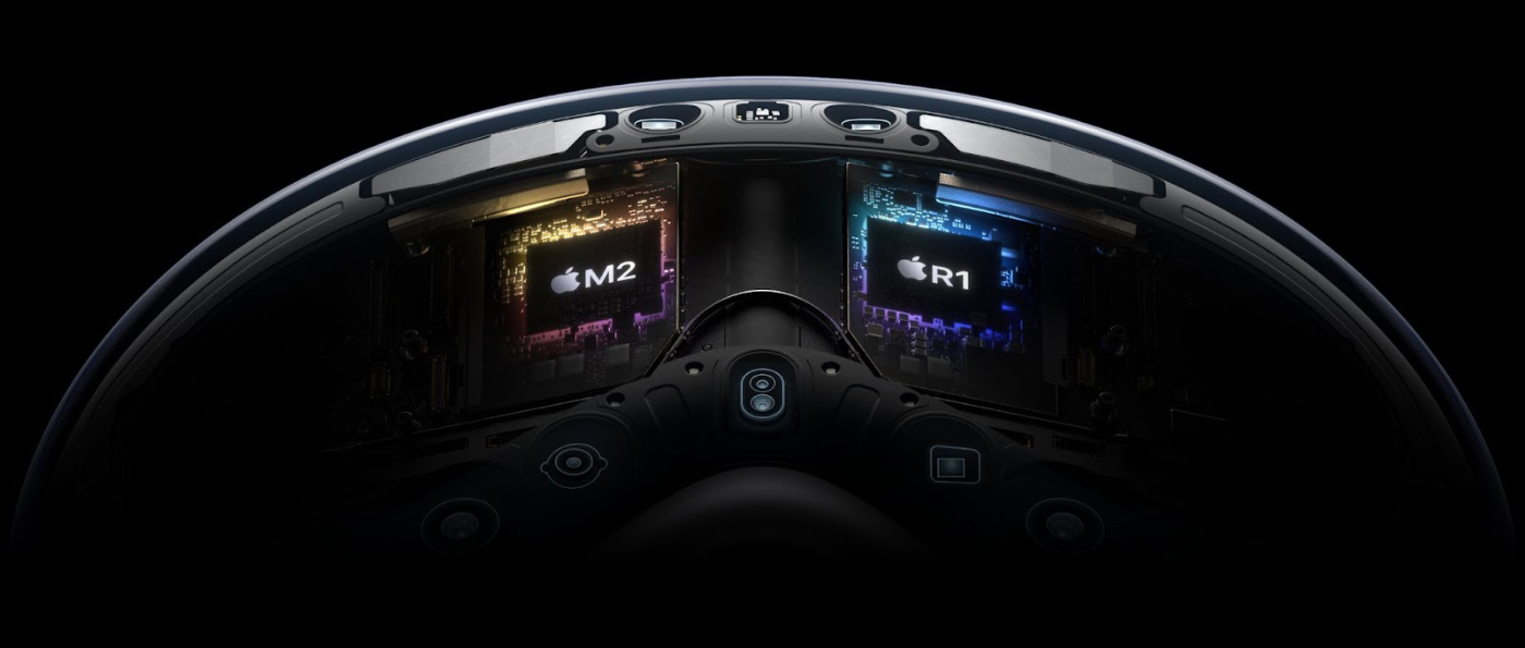
But perhaps the most tantalizing peek at the future is the R1 chip, newly unique to the Vision Pro. It’s “specifically dedicated to process input from the cameras, sensors, and microphones, streaming images to the displays within 12 milliseconds,” according to Apple. It powers a new “real-time execution engine that guarantees performance-critical workloads,” according to Apple’s headset lead Mike Rockwell.
As Ben Thompson noted on Stratechery, real-time operating systems are used for embedded systems *like cars*, in which processing data from a half-dozen or more cameras and sensors at one time is a critical life-or-death requirement.
Could Vision Pro be the first public hint at Apple’s automotive interests—or is the R1 the orphaned tech the car project left behind when it was shuttered? Only time will tell, as bits and pieces of tech and design language that were introduced with Vision Pro show up across Apple’s portfolio, starting its building-in-public lifecycle all over again.
An R1 chip powering Vision Pro’s real-time OS today. What could it power tomorrow?
Matthew Guay is co-founder of Pith & Pip, a content consultancy, and Reproof, an upcoming writing platform. Find him on Twitter.
Find Out What
Comes Next in Tech.
Start your free trial.
New ideas to help you build the future—in your inbox, every day. Trusted by over 75,000 readers.
SubscribeAlready have an account? Sign in
What's included?
-
Unlimited access to our daily essays by Dan Shipper, Evan Armstrong, and a roster of the best tech writers on the internet
-
Full access to an archive of hundreds of in-depth articles
-
-
Priority access and subscriber-only discounts to courses, events, and more
-
Ad-free experience
-
Access to our Discord community
Comments
Don't have an account? Sign up!